Colour is used to create a variety of moods in a room. It is a very influential aspect of how you want your room to feel and the style you want to design in the space. We tend to lean either towards colours with warm undertones or cool undertones. Whichever one you choose will have influence over your space.
If you are someone who prefers the glow of sunsets, then warm undertones will be for you. If you lean more towards wide open spaces with green grass and blue skies, then you may want to opt for cooler undertones.
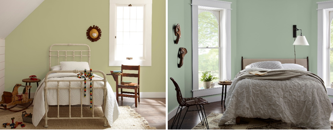
Back to Nature (left image) features yellow undertones making it a warmer green tone. It is effortless and captures the essence of relaxation. Jojoba (right image) when used is a cooler green with a touch of blue to it. It is versatile enough not only for a bedroom but to use in spaces you want to create a cooler look in.
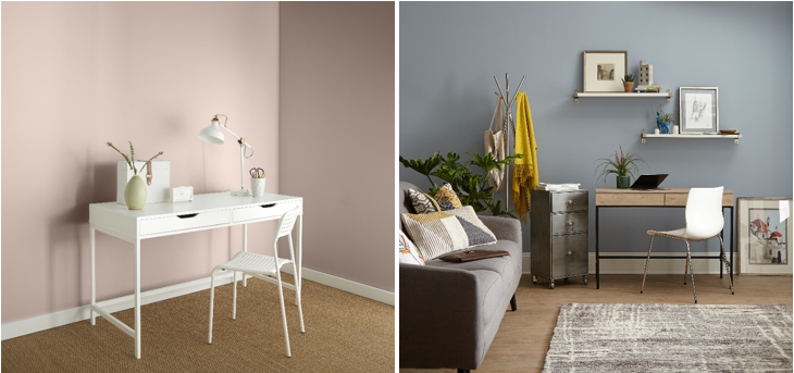
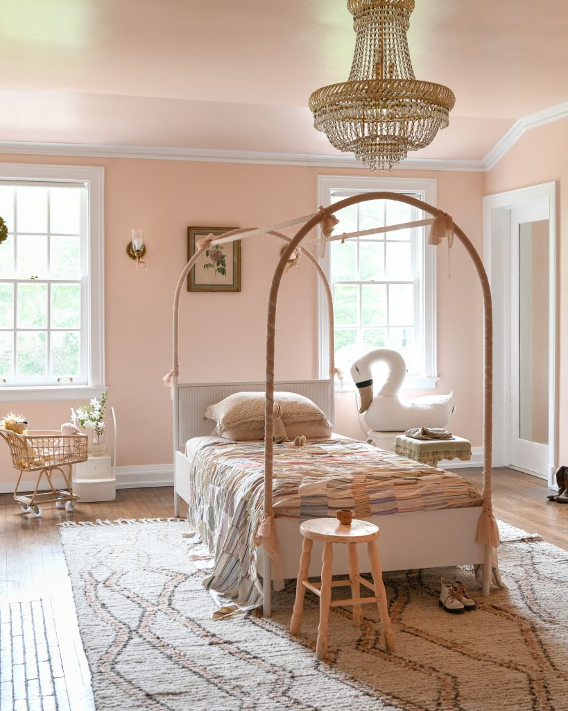
Much like a bold red, a pinky peach will still give off warmth in a most subtle way. Seaside Villa (left image) can be used to bring a sense of lightness and can be paired with white furnishings so the walls become the main focus. Dark Pewter (right image) is an icy grey with blue undertones. It will generate a cool space especially in an office where you want to relax your eyes after looking at a computer screen.
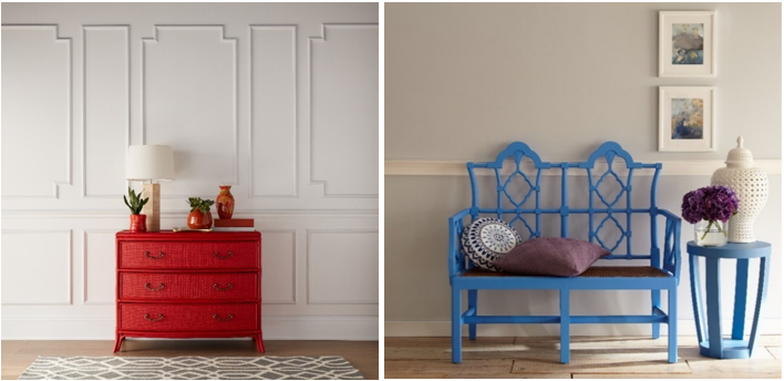
A simpler way to bring in warm and cool tones into a space is by adding it to furniture. A simple pop of Fire Cracker (left image) will add a fiery, bold statement. This colour emphasizes how warm colours can make us feel energized and happy. A cooler option is Perfect Sky (right image) which is sure to refresh and provide comfort simply by being seen on a bench.
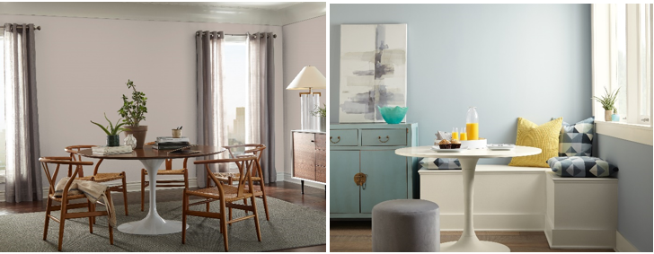
Choosing between greys is easy once you know if you prefer a warm or a cool toned grey. Graceful Gray (left image) is a great option if you prefer warm tones. This hue will elevate any space with its warm taupe undertones. If you prefer a cooler grey option then Zero Gravity (right image) is ideal. This hue has a soft blue undertone that will give you more of a coastal look and feel.
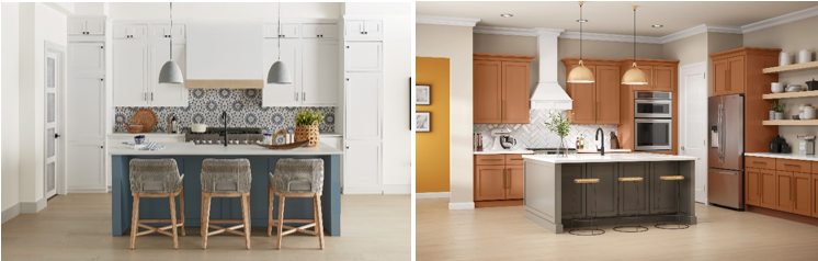
Introducing touches of coolness and warmth is also a great way to showcase your kitchen. Cool colours in a kitchen such as Adirondack Blue, (left image) which is a cool slate blue that is calm yet sophisticated can provide a subtle amount of coolness when painted on a kitchen island.
Painting kitchen cabinets a warm rust orange in Maple Glaze (right image) will evoke comfort with its warm undertones and give your kitchen a nice pop.
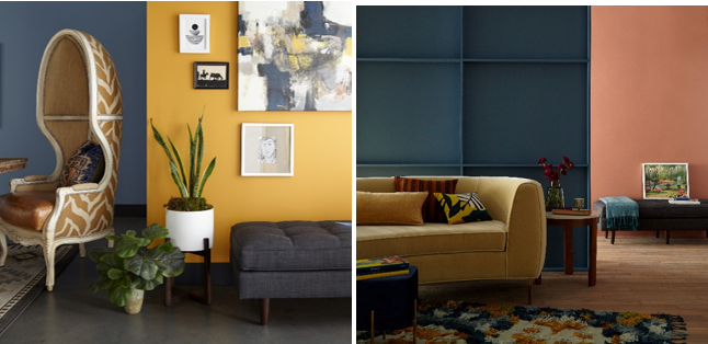
If you cannot decide between warm and cool colours for your space, embark on a new way of (to?) colour by combining the two together. Create a harmonious look with Jean Jacket Blue, (left image) a cool saturated denim blue, pairing it with Saffron Strands, (left image) an exotic gold that has deep warmth and charisma.
Another seamless look is pairing a cool steel blue in Blueprint (right image) with Mars Red (right image) which is a dusty pinky red hue. This combination is sure to provide some coolness while adding warmth, giving you the best of both worlds.
Narrow down your painting choices by deciding if you want to display the warmth of a sunset, the coolness of a bright sky or even a combination of both. Visit these colours and more on behr.ca.
Colourfully Yours,
Deanna