This International Colour Day, join us on a journey through a century of colour trends. Discover how historical events, social norms and changing technological advancements have shaped colour trends over time.
The 1920swas highly influenced by the Art Deco movement, introducing bold, energetic colours. This reflected the optimism of the roaring 20s while also embracing the softer pastels of the flapper style.
The 1930s saw a great colour shift as it reflected the Great Depression. The colour palette became more muted with earthy, grounded tones that reflected economic austerity. Some Art Deco influence remained with soft pastels and warm neutrals.
World War II heavily influenced the 1940s colour landscape. Early in the decade, wartime restrictions and rationing necessitated practical, subdued palettes dominated by olive green, khaki, and brown tones. After the war, a sense of optimism gradually emerged, and vibrant colours began to make a slow yet steady comeback
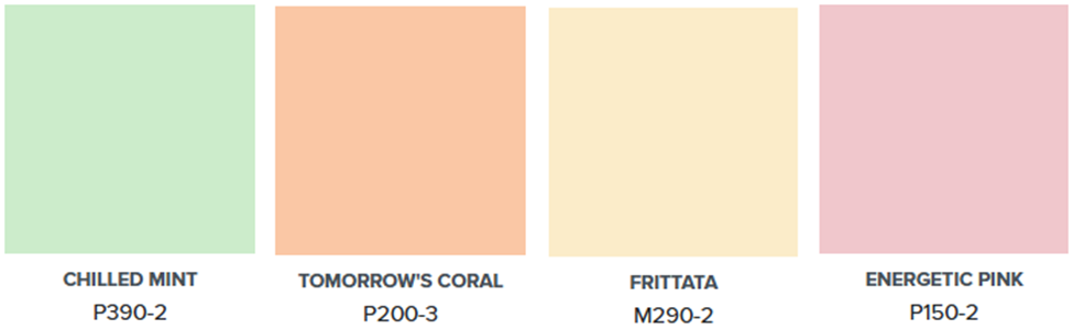
The 1950s was a vibrant decade for fashion, interior design and advertising. Colour came to life again with new materials and production processes. Pastels, bold accents and even black and white combinations revitalized the home.
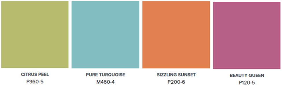
The 1960s was an era of bold, bright tones. Vivid orange, sunny yellow, lime green and turquoise were used for colour blocking in fashion and decor. Mid-century modern defined the decade.
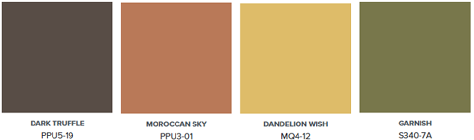
The 1970s saw a nature’s influence on colour. Palettes featured avocado green, harvest gold, burnt orange and deep earthy brown.
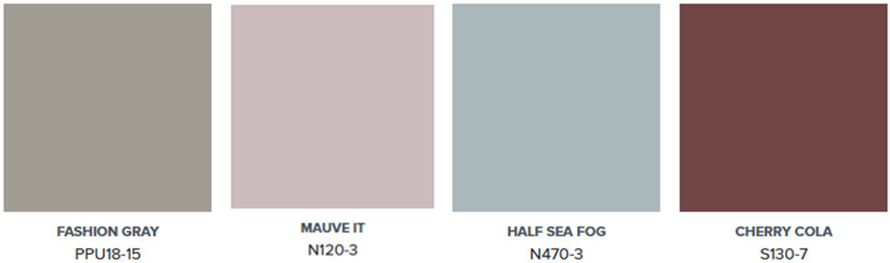
1980s fashion may have been all about neon brights, however home decor was more subdued. Mauve, grey, burgundy and country blue were abundant on walls, carpets, upholstery fabric and accessories.
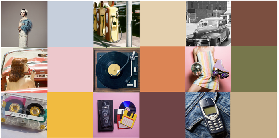
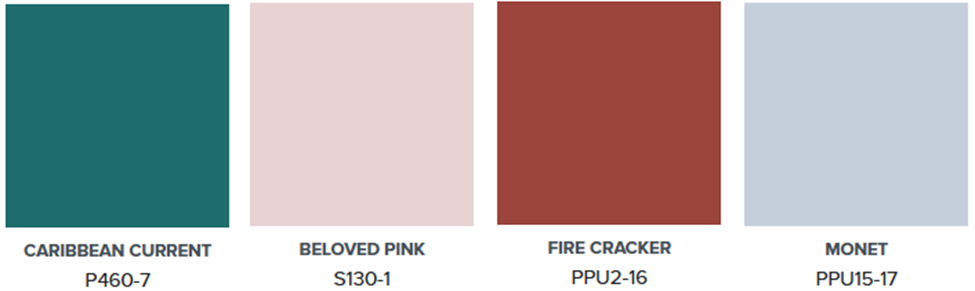
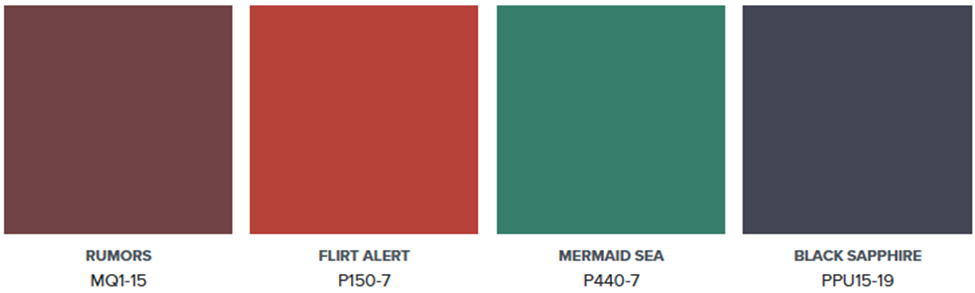
In the 1990s, jewel tones like emerald, sapphire, ruby and amethyst became popular. Red was a must-have accent colour, especially in a kitchen or dining area.
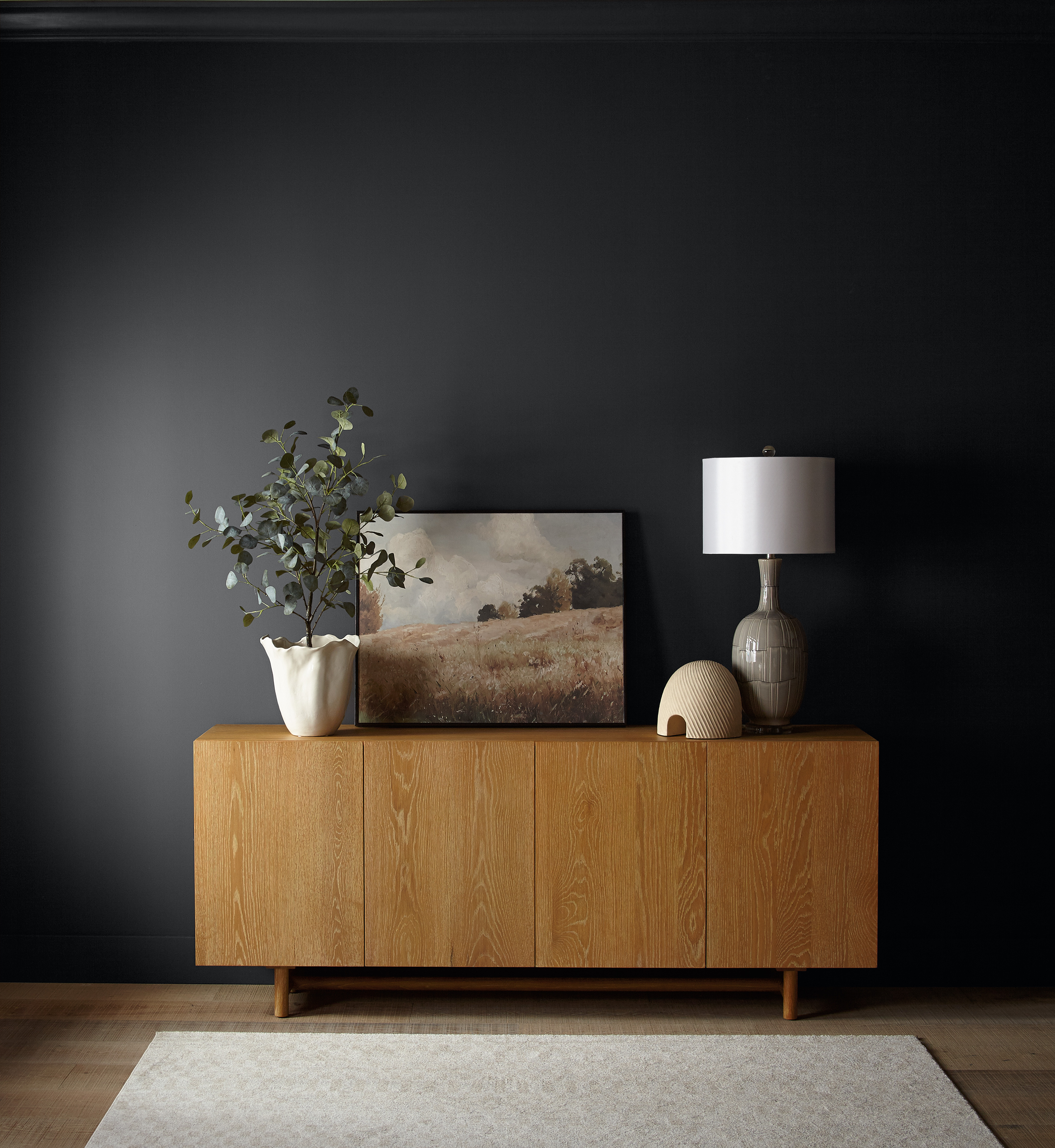
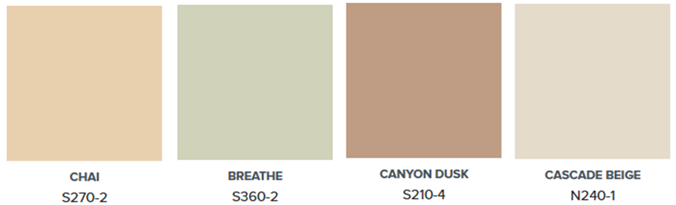
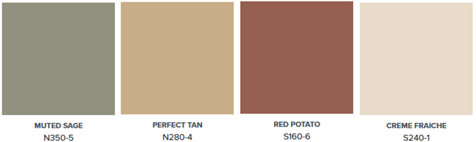
The 2000s saw a shift towards more neutral colours. Technology was advancing and global influences shaped interior design trends. Tuscan decor became popular with earthy, sun-baked colours.
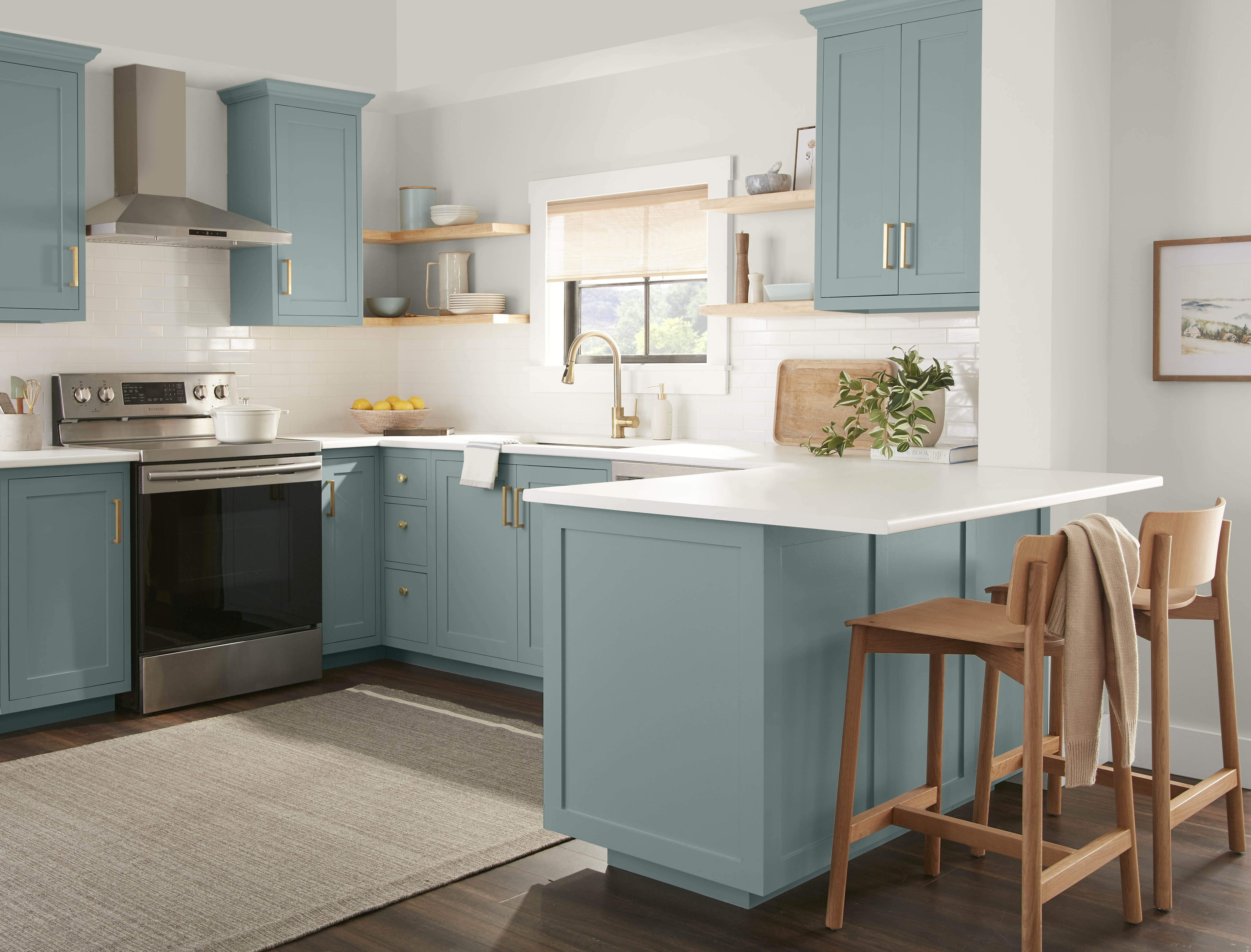
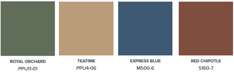
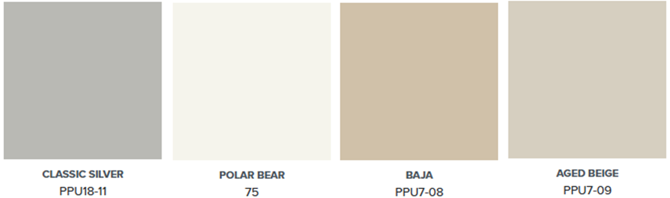
The 2010s was defined by personalization, comfort and simplicity. Social media made it easier to find trending styles and inspiration. Neutral colours were supported by bold accent colours.
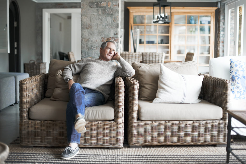
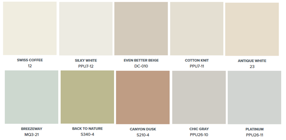
At the start of the pandemic in 2020, people surrounded themselves with calm and cozy white, cream and beige. Biophilic greens brought in a natural element while watery blues felt relaxed.
Colour trends are constantly changing to keep up with the times. It will be exciting to see what direction they go next.
Visit behr.ca to gather ideas for your next project, browse trends or see popular colours curated by our experts.
Colourfully Yours,
Erika